I have worked a bit on the fonts I use recently. From the main font I
use every day in my text editor and terminals to this very website, I
did a major and (hopefully) thoughtful overhaul of my typography, in
the hope of making things easier to use and, to be honest, just
prettier.
Editor and Terminal: Fira mono
This all started when I found out about the JetbrainsMono font. I found the idea of ligatures
fascinating: the result is truly beautiful. So I do what I often do
(sometimes to the despair of some fellow Debian members) and filed a
RFP to document my research.
As it turns out, Jetbrains Mono is not free enough to be packaged in
Debian, because it requires proprietary tools to build. I nevertheless
figured I could try another font so I looked at other monospace
alternatives. I found the following packages in debian:
Because Fira code had ligatures, i ended up giving it a shot. I really
like the originality of the font. See, for example, how the @ sign
looks when compared to my previous font, Liberation Mono:
Liberation Mono
Fira Mono
Interestingly, a colleague (thanks ahf!) pointed me to the Practical
Typography post "Ligatures in programming fonts: hell no", which
makes the very convincing argument that ligatures are downright
dangerous to programming environment. In my experiences with the
fonts, it was also not always giving the result I would expect. I also
remembered that the Emacs Haskell mode would have this tendency of
inserting crazy syntactic sugar like this in source code without being
asked, which I found extremely frustrating.
Besides, Emacs doesn't support ligatures, unless you count such
horrendous hacks which hack at the display time. That's because
Emacs' display layer is not based on a modern rendering library like
Pango but some scary legacy code that very few people
understand. On top of the complexity of the codebase, there is also
resistance in including a modern font.
So I ended up using Fira mono everywhere I use fixed-width fonts, even
though it's not packaged in Debian. That involves the following
configuration in my .Xresources (no, I haven't switched to Wayland):
! font settings
Emacs*font: Fira mono
rofi*font: Fira mono 12
! Symbola is to get emojis to display correctly, apt install fonts-symbola
!URxvt*font: xft:Monospace,xft:Symbola
URxvt*font: xft:Fira mono,xft:Symbola
I also dropped this script in ~/.local/share/fonts/download.sh, for
lack of a better way, to download all the fonts I'm interested in:
Update: I forgot to mention one motivation behind this was to work
around a change in the freetype interpreter, discussed in bug
866685 and my upgrades
documentation.
Website: Charter
That "hell no" article got me interested in the Practical
Typography web book, which I read over the weekend. It was an eye
opener and I realized I had already some of those concepts
implanted; in fact it's probably after reading the Typography in ten
minutes guide that I ended up trying Fira sans a few years
ago. I have removed that font since then,
however, after realising it was taking up an order of magnitude more
bandwidth space than the actual page content.
I really loved the book, so much that I actually bought it. I
liked the concept of it, the look, and the fact that it's a living
document. There's a lot of typography work I would need to do on this
site to catchup with the recommendations from Matthew
Butterick. Switching fonts is only one part of this, but it's
something I was excited to work on. So I sat down and reviewed the
free fonts Butterick recommends and tried out a few. I ended up
settling on Charter, a relatively old (in terms of computing)
font designed by Matthew Carter (of Verdana fame) in 1987.
Charter really looks great and is surprisingly small. While a single
version of Fira varies between 96KiB (Fira Sans Condensed) and 308KiB
(Fira Sans Medium Italic), Charter is only 28KiB! While it's still
about as large as most of my articles, I found it was a better
compromise and decided to make the jump. This site is now in Serif,
which is a huge change for me.
The change was done with the following CSS:
h1, h2, h3, h4, h5, body
    /*
     * Charter: Butterick's favorite, freely available, found on https://practicaltypography.com/free-fonts.html
     * Palatino: Mac OS
     * Palatino Linotype: Windows
     * Noto serif: Android, packaged in Debian
     * Liberation serif: Linux fallback
     * Serif: fallback
     */
    font-family: Charter, Palatino, "Palatino Linotype", "Noto serif", "Liberation serif", serif;
    /* Charter is available from https://practicaltypography.com/charter.html under the liberal Bitstream license */
I have also decided to outline headings by making them slanted, using
the beautiful italic version of Charter:
h1, h2, h3, h4, h5
    font-style: italic;
I also made the point size larger, if the display is large enough:
/* enlarge body point size for charter for larger displays */
@media (min-device-width: 750px)
    body
        font-size: 20px;
        line-height: 1.3; /* default in FF is ~1.48 */
Modern display (including fonts) have a much higher resolution and the
point size on my website was really getting too small to be
readable. This, in turn, required a change to the max-width:
#content
    /* about 2.5 alphabets with charter */
    max-width: 35em;
I have kept the footers and "UI" elements in sans-serif though, and
kept those aligned on operating system defaults or "system fonts":
/* some hacking at typefaces to get some fresh zest in here
 * fallbacks from:
 * https://en.wikipedia.org/wiki/List_of_typefaces_included_with_Microsoft_Windows
 * https://en.wikipedia.org/wiki/List_of_typefaces_included_with_macOS
 */
.navbar, .footer
    /*
     * Avenir: Mac, quite different but should still be pretty
     * Gill sans: Mac, Windows, somewhat similar to Avenir (indulge me)
     * Noto sans: Android, packaged in Debian
     * Open sans: Texlive extras AKA Linux, packaged in Debian
     * Fira sans: Mozilla's Firefox OS
     * Liberation sans: Linux fallback
     * Helvetica: general fallback
     * Sans-serif: fallback
     */
    font-family: Avenir, "Gill sans", "Noto sans", "Open sans", "Fira sans", "Liberation sans", Helvetica, sans-serif;
    /* Fira is available from https://github.com/mozilla/Fira/ under the SIL Open Font License */
    /* alternatively, just use system fonts for "controls" instead:
    font-family: -apple-system, BlinkMacSystemFont, "Segoe UI", "Roboto", "Oxygen", "Ubuntu", "Cantarell", "Fira Sans", "Droid Sans", "Helvetica Neue", sans-serif;
    gitlab uses: -apple-system, BlinkMacSystemFont, "Segoe UI", Roboto, "Noto Sans", Ubuntu, Cantarell, "Helvetica Neue", sans-serif, "Apple Color Emoji", "Segoe UI Emoji", "Segoe UI Symbol", "Noto Color Emoji"
    */
I've only done some preliminary testing of how this will look
like. Although I tested on a few devices (my phone, e-book tablet, an
iPad, and of course my laptop), I fully expect things to break on
your device. Do let me know if things look better or worse. For
future comparison, my site is well indexed in the Internet
Wayback Machine and can be used to look at the site before the
change. For example, compare the previous article here with its
earlier style.
The changes to the theme are of course available in my custom ikiwiki
bootstrap theme (see in particular commits 0bca0fb7 and
d1901fb8), as usual.
Enjoy, and let me know what you think!
PS: I considered just setting the Charter font in CSS and not adding
it as a @font-face. I'm still considering that option and might do
so if the performance cost is too big. The Fira mono font is
actually set like this for the preformatted sections of the site, but
because it's more common (and it's too big) I haven't added it as a
font-face. You might want to download the font locally to benefit from
the full experience as well.
PPS: As it turns out, an earlier version of this post featured exactly
that: a non-webfont version of Charter, which works fine if you have a
good Charter font available. But it looks absolutely terrible if, like
many Linux users, you have the nasty bitmap font shipped with
xfonts-100dpi and xfonts-75dpi. So I fixed the webfont and
it's unlikely this site will be able to load reasonably well in Linux
until those packages are removed or bitmap font rendering is disabled.
Narabu is a new intraframe video codec. You probably want to read
part 1,
part 2,
part 3,
part 4
and
part 5
first.
Like I wrote in part 5, there basically isn't a big splashy ending where
everything is resolved here; you're basically getting some graphs with
some open questions and some interesting observations.
First of all, though, I'll need to make a correction: In the last part,
I wrote that encoding takes 1.2 ms for 720p luma-only on my GTX 950,
which isn't correct I remembered the wrong number. The right number is
2.3 ms, which I guess explains even more why I don't think it's acceptable
at the current stage. (I'm also pretty sure it's possible to rearchitect
the encoder so that it's much better, but I am moving on to other
video-related things for the time being.)
I encoded a picture straight off my DSLR (luma-only) at various resolutions,
keeping the aspect. Then I decoded it a bunch of times on my GTX 950
(low-end last-generation NVIDIA) and on my HD 4400 (ultraportable Haswell
laptop) and measured the times. They're normalized for megapixels per second
decoded; remember that doubling width (x axis) means quadruple the pixels.
Here it is:
I'm not going to comment much beyond two observations:
Caches matter, even on GPU. This is the same data over and over again (so small
images get an unrealistic boost), so up to a certain point, it's basically
all in L1.
The GTX 950 doesn't really run away from the Intel card before it's getting
enough data to chew on. Bigger GPUs don't have faster cores they're just more parallel.
Encoding only contains the GTX 950 because I didn't finish the work to get
that single int64 divide off:
This is interesting. I have few explanations. Probably more benchmarking and
profiling would be needed to make sense of any of it. In fact, it's so
strange that I would suspect a bug, but it does indeed seem to create a
valid bitstream that is decoded by the decoder.
Do note, however, that seemingly even on the smallest resolutions, there's a
1.7 ms base cost (you can't see it on the picture, but you'd see it in an
unnormalized graph). I don't have a very good explanation for this either
(even though there are some costs that are dependent on the alphabet size
instead of the number of pixels), but figuring it out would probably be a
great start for getting the performance up.
So that concludes the series, on a cliffhanger. :-) Even though it's not in a
situation where you can just take it and put it into something useful, I hope
it was an interesting introduction to the GPU! And in the meantime, I've
released version 1.6.3 of Nageru, my live video
mixer (also heavily GPU-based) with various small adjustments and bug fixes
found before and during Tr ndisk. And Movit is getting compute shaders
for that extra speed boost, although parts of it is bending my head.
Exciting times in GPU land :-)
Drop README.source from files to check against file-contains-trailing-whitespace as it can include literal quotes from upstreams that would be ideally left intact.
Add example on how to remove trailing whitespace with sed.
Tests:
Split out checks for debconf-config-not-executable into a separate test protected by a Test-Requires now that dpkg1.19.0 will bail out on that condition.
Correct Depends of python2.7python3 in a Python 3 test package.
Add test for ignoring python-foo-doc packages for the Python 3 migration and correct short descriptions of test packages.
Whilst anyone can inspect the source code of free software for malicious flaws, most software is distributed pre-compiled to end users.
The motivation behind the Reproducible Builds effort is to allow verification that no flaws have been introduced either maliciously or accidentally during this compilation process by promising identical results are always generated from a given source, thus allowing multiple third-parties to come to a consensus on whether a build was compromised.
I have generously been awarded a grant from the Core Infrastructure Initiative to fund my work in this area.
This month I:
Categorised a large number of packages and issues in the Reproducible Builds "notes" repository.
Worked on publishing our weekly reports. (#128, #129, #130 & #131)
I also made the following changes to our tooling:
diffoscope
diffoscope is our in-depth and content-aware diff utility that can locate and diagnose reproducibility issues.
Improve names in output of "internal" binwalk members. (#877525).
Don't crash on malformed md5sums files. (#877473).
Omit misleading "any of" prefix when only complaining about a single module on import. [...]
Adjust tests as ps2ascii now varies its output on timezone. [...]
strip-nondeterminism
strip-nondeterminism is our tool to remove specific non-deterministic results from a completed build.
Clojure considers .class file to be stale if it shares the same timestamp of the .clj. We thus adjust the timestamps of the .clj to always be younger. (#877418).
Print a message in --verbose mode if no canonical time was specified. [...]
buildinfo.debian.net
buildinfo.debian.net is my experiment into how to process, store and distribute .buildinfo files after the Debian archive software has processed them.
Always show SHA-256 checksums, regardless of the browser viewport size. [...]
Add an API endpoint to fetch specific .buildinfo files for a certain package/version/architecture. [...]
Debian
My activities as the current Debian Project Leader are covered in my "Bits from the DPL" email to the debian-devel-announce mailing list.
Patches contributed
devscripts: Please print the actual arguments debuild makes to Lintian. (#880124)
hw-detect: Drop reference to floppy disks; it's almost 2018. (#880122)
debci:
Use deb.debian.org over http.debian.net. (#879654)
Document how to use an alternative mirror. (#879655)
Followed up on a large number of upstream "pings" that have been left dormant.
Issued DLA 1121-1 to fix an out-of-bounds read vulnerability in curl where a malicious FTP server could abuse this to prevent clients from interacting with it.
Issued DLA 1123-1 for the "Go" programming language where an attacker could generate a MIME request such that the server ran out of file descriptors.
Issued DLA 1126-1 for the libxfont font selection and rasterisation library, correcting two vulnerabilities, both involving the library being tricked into reading invalid/random memory.
Issued DLA 1134-1 for sdl-image1.2, an image loading library. A maliciously-crafted .xcf file could cause a stack-based buffer overflow resulting in potential code execution.
I just uploaded APT 1.6 alpha 1, introducing a very scary thing: Seccomp sandboxing for methods, the programs downloading files from the internet and decompressing or compressing stuff. With seccomp I reduced the number of system calls these methods can use to 149 from 430. Specifically we excluded most ways of IPC, xattrs, and most importantly, the ability for methods to clone(2), fork(2), or execve(2) (or execveat(2)). Yes, that s right methods can no longer execute programs.
This was a real problem, because the http method did in fact execute programs there is this small option called ProxyAutoDetect or Proxy-Auto-Detect where you can specify a script to run for an URL and the script outputs a (list of) proxies. In order to be able to seccomp the http method, I moved the invocation of the script to the parent process. The parent process now executes the script within the sandbox user, but without seccomp (obviously).
I tested the code on amd64, ppc64el, s390x, arm64, mipsel, i386, and armhf. I hope it works on all other architectures libseccomp is currently built for in Debian, but I did not check that, so your apt might be broken now if you use powerpc, powerpcspe, armel, mips, mips64el, hhpa, or x32 (I don t think you can even really use x32).
Also, apt-transport-https is gone for good now. When installing the new apt release, any installed apt-transport-https package is removed (apt breaks apt-transport-https now, but it also provides it versioned, so any dependencies should still be satisfiable).
David also did a few cool bug fixes again, finally teaching apt-key to ignore unsupported GPG key files instead of causing weird errors Filed under: Uncategorized
How do you attract contributors to a new free software project?
I'm in the very early stages of a new personal project. It is
irrelevant for this blog post what the new project actually is.
Instead, I am thinking about the following question:
Do I want the project to be mainly for myself, and maybe a handful
of others, or do I want to try to make it a more generally useful,
possibly even a well-known, popular project? In other words, do I
want to just solve a specific problem I have or try to solve it for
a large group of people?
If it's a personal project, I'm all set. I can just start writing
code. (In fact, I have.) If it's the latter, I'll need to attract
contributions from others, and how do I do that?
I asked that question on Twitter and Mastodon and got several
suggestions. This is a summary of those, with some editorialising from
me.
The most important thing is probably that the project should aim for
something that interests other people. The more people it interests,
the easier it will be to attract contributors. This should be
written up and displayed prominently: what does (or will) the
software do and what can it e used for.
Having something that kind of works, and easy to improve, seems to
also be key. An empty project is daunting to do anything with. Part
of this is that the software the project is producing should be easy
to install and get running. It doesn't have to be fully featured. It
doesn't even have to be alpha level quality. It needs to do
something.
If the project is about producing a spell checker, say, and it
doesn't even try to read an input file, it's probably too early for
anyone else to contribute. A spell checker that lists every word in
the input file as badly spelt is probably more attractive to
contribute to.
It helps to document where a new contributor should start, and how
they would submit their contribution. A list of easy things to work
on may also help. Having a roadmap of near future developent steps
and a long-term vision will make things easier. Having an
architectural document to explain how the system hangs together will
help.
A welcoming, constructive atmosphere helps. People should get quick
feedback to questions, issues, patches, in order to build momentum.
Make it fun for people to contibute, and they'll contribute more.
A public source code repository, and a public ticketing system, and
public discussion forums (mailing lists, web forums, IRC channels,
etc) will help.
Share the power in the project. Give others the power to make
decisions, or merge things from other contributors. Having a clear,
functioning governance structure from the start helps.
I don't know if these things are all correct, or that they're enough
to grow a successful, popular project.
Karl Foger'l seminal book Producing Open Source Software should
also be mentioned.
Here is my monthly update covering what I have been doing in the free software world in September 2017 (previous month):
Submitted a pull request to Quadrapassel (the Gnome version of Tetris) to start a new game when the pause button is pressed outside of a game. This means you would no longer have to use the mouse to start a new game. [...]
Made a large number of improvements to AptFS my FUSE-based filesystem that provides a view on unpacked Debian source packages as regular folders including moving away from manual parsing of package lists [...] and numerous code tidying/refactoring changes.
Sent a small patch to django-sitetree, a Django library for menu and breadcrumb navigation elements to not mask test exit codes from the surrounding shell. [...]
Updated travis.debian.net, my hosted service for projects that host their Debian packaging on GitHub to use the Travis CI continuous integration platform to test builds:
Merged a pull request from James McCoy to pass DEB_BUILD_PROFILES through to the build. [...]
Workaround Travis CI's HTTP proxy which does not appear to support SRV records. [...]
Run debc from devscripts if the build was successful [...] and output the .buildinfo file if it exists [...].
Fixed a few issues in local-debian-mirror, my package to easily maintain and customise a local Debian mirror via the DebConf configuration tool:
Fix an issue where file permissions from the remote could result in a local archive that was impossible to access. [...]
Clear out empty directories on the local repository. [...]
Updated django-staticfiles-dotd, my Django staticfiles adaptor to concatentate static media in .d-style directories to support Python 3.x by using bytes objects (commit) and move away from monkeypatch as it does not have a Python 3.x port yet (commit).
Whilst anyone can inspect the source code of free software for malicious flaws, most software is distributed pre-compiled to end users.
The motivation behind the Reproducible Builds effort is to allow verification that no flaws have been introduced either maliciously or accidentally during this compilation process by promising identical results are always generated from a given source, thus allowing multiple third-parties to come to a consensus on whether a build was compromised.
I have generously been awarded a grant from the Core Infrastructure Initiative to fund my work in this area.
This month I:
Published a short blog post about how to determine which packages on your system are reproducible. [...]
Submitted a pull request for Numpy to make the generated config.py files reproducible. [...]
Provided a patch to GTK upstream to ensure the immodules.cache files are reproducible. [...]
Within Debian:
Updated isdebianreproducibleyet.com, moving it to HTTPS, adding cachebusting as well as keeping the number up-to-date.
Submitted the following patches to fix reproducibility-related toolchain issues:
gdk-pixbuf: Make the output of gdk-pixbuf-query-loaders reproducible. (#875704)
diffoscope is our in-depth and content-aware diff utility that can locate and diagnose reproducibility issues.
Filed an issue attempting to identify the causes behind an increased number of timeouts visible in our CI infrastructure, including running a number of benchmarks of recent versions. (#875324)
New features:
Add "binwalking" support to analyse concatenated CPIO archives such as initramfs images. (#820631).
Print a message if we are reading data from standard input. [...]
Bug fixes:
Loosen matching of file(1)'s output to ensure we correctly also match TTF files under file version 5.32. [...]
Correct references to path_apparent_size in comparators.utils.file and self.buf in diffoscope.diff. [...] [...]
Testing:
Make failing some critical flake8 tests result in a failed build. [...]
Numerous PEP8, flake8, whitespace, other cosmetic tidy-ups.
strip-nondeterminism
strip-nondeterminism is our tool to remove specific non-deterministic results from a completed build.
Log which handler processed a file. (#876140). [...]
disorderfs
disorderfs is our FUSE-based filesystem that deliberately introduces non-determinism into directory system calls in order to flush out reproducibility issues.
Lintian
I made a large number of changes to Lintian, the static analysis tool for Debian packages. It reports on various errors, omissions and general quality-assurance issues to maintainers:
Add 4.1.1 as a supported Standards-Version. (#875509)
Warn about Django libraries that do not depend on Django itself. (#877292)
Add a --list-tags option to print all tags Lintian knows about. (#779675)
Prevent false positives in copyright-year-in-future when matching URLs, the Tcl license (#876360) and "meta" statements such as "Original Author" (#873323).
Update the description of unknown-testsuite to reflect that autopkgtest is not the only valid value. (#876003)
Apply patch from Guillem Jover to add more package section mappings. (#874121)
Update the data/fields/perl-provides and data/fields/virtual-packages files from the archive; the latter fixes a false positive in bacula-director. (#835120)
Apply a patch from Jakub Wilk to prevent test failures on armhf/arm64, etc. (#877147)
Apply patch from Gianfranco Costamagnato fix a failing LFS test on 32-bit architectures. (#876343)
Correct Depends of python2.7python3 in Python 3 test package.
Update private/generate-tag-summary to ensure that git-describe(1) will always emit 7 hexadecimal digits as the abbreviated object name, use deb.debian.org as the default mirror, and update the remote locations of Contents-<arch> files.
Issued DLA 1084-1 and DLA 1085-1 for libidn and libidn2-0 to fix an integer overflow vulnerabilities in Punycode handling.
Issued DLA 1091-1 for unrar-free to prevent a directory traversal vulnerability from a specially-crafted .rar archive. This update introduces an regression test.
Issued DLA 1092-1 for libarchive to prevent malicious .xar archives causing a denial of service via a heap-based buffer over-read.
4.0.2-2 Update 0004-redis-check-rdb autopkgtest test to ensure that the redis.rdb file exists before testing against it.
4.0.2-2~bpo9+1 Upload to stretch-backports.
aptfs (0.11.0-1) New upstream release, moving away from using /var/lib/apt/lists internals. Thanks to Julian Andres Klode for a helpful bug report. (#874765)
lintian (2.5.53, 2.5.54) New upstream releases. (Documented in more detail above.)
Part of services of Kaplan open source consulting is recruiting services to help companies find good open source people. In addition, we also try to help the community to find open source friendly businesses to work at.
Expect the Usual Suspects (e.g. RedHat), I encounter job descriptions which convince me these companies know the advantages of using open source projects and hiring open source people.
A few recent examples I found in Israel:
Advantages: People who like to build stuff (we really like people who maintain/contribute to open source projects) (Wizer Research)
You will: Incubate and contribute to open source projects (iguazio)
The X factor significant contribution to an open-source community (unnamed startup)
An example open source project our team released is CoreML (Apple)
Job Responsibilities: Write open-source tools and contribute to open-source projects. (unnamed startup)
We d like to talk to people who: Appreciate open-source culture and philosophy. (Seeking Alpha)
From the applicant side, the possibility to know which code base he or she is going to work on could help do a better and more educated choice about the offered position. While from the company side, getting hard evidence of what are the applicant capabilities and code looks like instead of just describing them or trying to demonstrate them on short tests. Not to mention the applicant s ability to work as part of a team or community.
For the Israeli readers, you can see the full list at https://kaplanopensource.co.il/jobs/ Filed under: Israeli Community, Open source businesses
APT 1.5 is out, after almost 3 months the release of 1.5 alpha 1, and almost six months since the release of 1.4 on April 1st. This release cycle was unusually short, as 1.4 was the stretch release series and the zesty release series, and we waited for the latter of these releases before we started 1.5. In related news, 1.4.8 hit stretch-proposed-updates today, and is waiting in the unapproved queue for zesty.
This release series moves https support from apt-transport-https into apt proper, bringing with it support for https:// proxies, and support for autodetectproxy scripts that return http, https, and socks5h proxies for both http and https.
Unattended updates and upgrades now work better: The dependency on network-online was removed and we introduced a meta wait-online helper with support for NetworkManager, systemd-networkd, and connman that allows us to wait for network even if we want to run updates directly after a resume (which might or might not have worked before, depending on whether update ran before or after network was back up again). This also improves a boot performance regression for systems with rc.local files:
The rc.local.service unit specified After=network-online.target, and login stuff was After=rc.local.service, and apt-daily.timer was Wants=network-online.target, causing network-online.target to be pulled into the boot and the rc.local.service ordering dependency to take effect, significantly slowing down the boot.
An earlier less intrusive variant of that fix is in 1.4.8: It just moves the network-online.target Want/After from apt-daily.timer to apt-daily.service so most boots are uncoupled now. I hope we get the full solution into stretch in a later point release, but we should gather some experience first before discussing this with the release time.
Balint Reczey also provided a patch to increase the time out before killing the daily upgrade service to 15 minutes, to actually give unattended-upgrades some time to finish an in-progress update. Honestly, I d have though the machine hung up and force rebooted it after 5 seconds already. (this patch is also in 1.4.8)
We also made sure that unreadable config files no longer cause an error, but only a warning, as that was sort of a regression from previous releases; and we added documentation for /etc/apt/auth.conf, so people actually know the preferred way to place sensitive data like passwords (and can make their sources.list files world-readable again).
We also fixed apt-cdrom to support discs without MD5 hashes for Sources (the Files field), and re-enabled support for udev-based detection of cdrom devices which was accidentally broken for 4 years, as it was trying to load libudev.so.0 at runtime, but that library had an SONAME change to libudev.so.1 we now link against it normally.
Furthermore, if certain information in Release files change, like the codename, apt will now request confirmation from the user, avoiding a scenario where a user has stable in their sources.list and accidentally upgrades to the next release when it becomes stable.
Paul Wise contributed patches to allow configuring the apt-daily intervals more easily apt-daily is invoked twice a day by systemd but has more fine-grained internal timestamp files. You can now specify the intervals in seconds, minutes, hours, and day units, or specify always to always run (that is, up to twice a day on systemd, once per day on non-systemd platforms).
Development for the 1.6 series has started, and I intent to upload a first alpha to unstable in about a week, removing the apt-transport-https package and enabling compressed index files by default (save space, a lot of space, at not much performance cost thanks to lz4). There will also be some small clean ups in there, but I don t expect any life-changing changes for now.
I think our new approach of uploading development releases directly to unstable instead of parking them in experimental is working out well. Some people are confused why alpha releases appear in unstable, but let me just say one thing: These labels basically just indicate feature-completeness, and not stability. An alpha is just very likely to get a lot more features, a beta is less likely (all the big stuff is in), and the release candidates just fix bugs.
Also, we now have 3 active stable series: The 1.2 LTS series, 1.4 medium LTS, and 1.5. 1.2 receives updates as part of Ubuntu 16.04 (xenial), 1.4 as part of Debian 9.0 (stretch) and Ubuntu 17.04 (zesty); whereas 1.5 will only be supported for 9 months (as part of Ubuntu 17.10). I think the stable release series are working well, although 1.4 is a bit tricky being shared by stretch and zesty right now (but zesty is history soon, so ). Filed under: Debian, Ubuntu
I d like to start making weekly reports again on my free software efforts. Part of the reason for these reports is for me to see how much time I m putting into free software. Hopefully I can keep these reports up.
Debian
I have updated txtorcon (a Twisted-based asynchronous Tor control protocol implementation used by ooniprobe, magic-wormhole and tahoe-lafs) to its latest upstream version. I ve also added two new binary packages that are built by the txtorcon source package: python3-txtorcon and python-txtorcon-doc for Python 3 support and generated HTML documentation respectively.
I have gone through the scapy (Python module for the forging and dissection of network packets) bugs and closed a couple that seem to have been silently fixed by new upstream releases and not been caught in the BTS. I ve uploaded a minor revision to include a patch that fixes the version number reported by scapy.
I have prepared and uploaded a new package for measurement-kit (a portable C++11 network measurement library) from the Open Observatory of Network Interference, which at time of writing is still in the NEW queue. I have also updated ooniprobe (probe for the Open Observatory of Network Interference) to its latest upstream version.
I have updated the Swedish debconf strings in the xastir (X Amateur Station Tracking and Information Reporting) package, thanks to the translators.
I have updated the direwolf (soundcard terminal node controller for APRS) package to its latest upstream version and fixed the creation of the system user to run direwolf with systemd to happen at the time the package is installed. Unfortunately, it has been necessary to drop the PDF documentation from the package as I was unable to contact the upstream author and acquire the Microsoft Word sources for this release.
I have reviewed and sponsored the uploads of the new packages comptext (GUI based tool to compare two text streams), comptty (GUI based tool to compare two radio teletype streams) and flnet (amateur radio net control station software) in the hamradio team. Thanks to Ana Custura for preparing those packages, comptext and comptty are now available in unstable.
I have updated the Debian Hamradio Blend metapackages to include cubicsdr (a software defined radio receiver). This build also refreshes the list of packages that can now be included as they had not been packaged at the time of the last build.
I have produced and uploaded an initial package for python-azure-devtools (development tools for Azure SDK and CLI for Python) and have updated python-azure (the Azure SDK for Python) to a recent git snapshot. Due to some issues with python-vcr it is currently not possible to run the test suite as part of the build process and I m watching the situation. I have also fixed the auto dependency generation for python3-azure, which had previously been broken.
Bugs closed (fixed/wontfix): #873036, #871940, #869566, #873083, #867420, #861753, #855385, #855497, #684727, #683711
Tor Project
I have been working through tickets for Atlas (a tool for looking up details about Tor relays and bridges) and have merged and deployed a number of fixes. Some highlights include: bandwidth sorting in search results is now semantically correct (not just an alphanumeric sort ignoring units), added when a relay was first seen to the details page along with the host name if a reverse DNS record has been found for the IP address of the relay and added support for the NoEdConsensus flag (although happily no relays had this flag at the time this support was added).
The metrics team has been working on merging projects into the metrics team website to give a unified view of information about the Tor network. This week I have been working towards a prototype of a port of Atlas to the metrics website s style and this work has been published in my personal Atlas git repository. If you d like to have a click around, you can do so.
A relay operators meetup will be happening in Montreal on the 14th of October. I won t be present, but I have taken this opportunity to ask operators if there s anything that they would like from Atlas that they are not currently getting. Some feedback has already been received and turned into code and trac tickets.
I also attended the weekly metrics team meeting in #tor-dev.
Bugs closed (fixed/wontfix): #6787, #9814, #21958, #21636, #23296, #23160
Sustainability
I believe it is important to be clear not only about the work I have already completed but also about the sustainability of this work into the future. I plan to include a short report on the current sustainability of my work in each weekly report.
I continue to be happy to spend my time on this work, however I do find myself in a position where it may not be sustainable when it comes to hardware. My desktop, a Sun Ultra 24, is now 10 years old and I m starting to see random reboots which so far have not been explained. It is incredibly annoying to have this happen during a long build. Further, the hard drives in my NAS which are used for the local backups and for my local Debian mirror are starting to show SMART errors. It is not currently within my budget to replace any of this hardware. Please contact me if you believe you can help.
This week's energy was provided by Club Mate
Thanks to a Mozilla Open Source Software award, we have been working
on making the Tails ISO images
build reproducibly.
We have made huge progress: since a few months, ISO images built by
Tails core developers and our CI system have always been identical.
But we're not done yet and we need your help!
Our first call for testing build reproducibility in August uncovered
a number of remaining issues. We think that we have fixed them all
since, and we now want to find out what other problems may prevent you
from building our ISO image reproducibly.
Please try to build an ISO image today, and tell us whether it
matches ours!
Build an ISO
These instructions have been tested on Debian Stretch and testing/sid.
If you're using another distribution, you may need to adjust them.
If you get stuck at some point in the process, see our more detailed
build documentation
and don't hesitate to contact us:
Send us feedback!
No matter how your build attempt turned out we are interested in your
feedback.
Gather system information
To gather the information we need about your system, run the following
commands in the terminal where you've run rake build:
sudo apt install apt-show-versions && \
(
  for f in /etc/issue /proc/cpuinfo
  do
    echo "--- File: $ f  ---"
    cat "$ f "
    echo
  done
  for c in free locale env 'uname -a' '/usr/sbin/libvirtd --version' \
            'qemu-system-x86_64 --version' 'vagrant --version'
  do
    echo "--- Command: $ c  ---"
    eval "$ c "
    echo
  done
  echo '--- APT package versions ---'
  apt-show-versions qemu:amd64 linux-image-amd64:amd64 vagrant \
                    libvirt0:amd64
)   bzip2 > system-info.txt.bz2
Then check that the generated file doesn't contain any sensitive
information you do not want to leak:
bzless system-info.txt.bz2
Next, please follow the instructions below that match your situation!
If the build failed
Sorry about that. Please help us fix it by
opening a ticket:
set Category to Build system;
paste the output of rake build;
attach system-info.txt.bz2 (this will publish that file).
If the build succeeded
Compute the SHA-512 checksum of the resulting ISO image:
If the checksums match: success, congrats for reproducing Tails
3.2~alpha2! Please send an email to tails-dev@boum.org (public) or
tails@boum.org (private) with the subject "Reproduction of Tails
3.2~alpha2 successful" and system-info.txt.bz2 attached. Thanks in
advance! Then you can stop reading here.
Else, if the checksums differ: too bad, but really it's good news as
the whole point of the exercise is precisely to identify such
problems :) Now you are in a great position to help improve the
reproducibility of Tails ISO images by following these instructions:
Install diffoscope version 83 or higher and all the packages it
recommends. For example, if you're using Debian Stretch:
Send an email to tails-dev@boum.org (public) or tails@boum.org
(private) with the subject "Reproduction of Tails 3.2~alpha2
failed", attaching:
system-info.txt.bz2;
the smallest file among diffoscope.txt.bz2 and
diffoscope.html.bz2, except if they are larger than 100 KiB, in
which case better upload the file somewhere (e.g.
share.riseup.net and share the link
in your email.
Thanks a lot!
Credits
Thanks to Ulrike & anonym who authored a draft on which this blog post
is based.
During Debconf17 I was asked by Daniel Pocock if I can attend FOSScamp Syros to help with Debian s l10n in the Balkans. I said I would be happy to, although my visit would be short (2.5 days) due to previous plans. The main idea of camp is to have FOSS people meet for about 1 week near a beach. So it s sun, water and free software. This year it takes place in Syros, Greece.
After take the morning ferry, I met with the guys at noon. I didn t know how would it be, as it s my first time with this group/meeting, but they were very nice and welcoming. 10 minutes after my arrival I found myself setting with two of the female attendees starting to work on Albanian (sq) translation of Debian Installer.
It took my a few minutes to find my where to check out the current level1 files, as I thought they aren t in SVN anymore, but ended up learning the PO files is the only part of the installer still on SVN. As the girls were quick with the assinged levle1 sublevels, I started to look for the level2 and level3 files, and it was annoying to have the POT files very accessible, but no links to the relevant git repositories. I do want to have all the relevant links in one central place, so people who want to help with translation could do that.
While some of the team member just used a text editor to edit the files, I suggested to them using either poedit or granslator, both I used a few years ago. Yaron Shahrabani also recommended virtaal to me, but after trying it for a while I didn t like it (expect it s great feature showing the diff with fuzzy messages). For the few people who also have Windows on their machine, both poedit and Virtaal have windows binaries for download. So you don t have to have Linux in order to help with translations.
In parallel, I used the free time to work on the Hebrew translation for level1, as it s been a while since either me or Omer Zak worked on it. Quite soon the guys started to send me the files for review, and I did find some errors using diff. Especially when not everyone use a PO editor. I also missed a few strings during the review, which got fixed later on by Christian Perrier. Team work indeed (:
I found it interesting to see the reactions and problems for the team to work with the PO files, and most projects now use some system (e.g. Pootle) for online web translation. Which saves some of the head ace, but also prevents from making some review and quality check before submitting the files. It s a good idea to explore this option for Debian as well.
A tip for those who do want to work with PO files, either use git s diff features or use colordiff to check your changes (notice less will require -R parameter to keep the color).
Although I met the guys only at noon, the day was very fruitful for Debian Installer l10n:
Albanian (sq) level1 from 78% to 82% (Eva Vranici, Silva Arapi)
Albanian (sq) level2 from 20% to 24% (Nafie Shehu)
Hebrew (he) level1 from 96% to 97% (me)
Greek (el) level1 from 96% to 97% (Sotirios Vrachas)
Some files are still work in progress and will be completed tomorrow. My goal is to have Albanian at 100% during the camp and ready for the next d-i alpha.
I must admit that I remember d-i to have many more strings as part of the 3 levels, especially levels 2+3 which were huge (e.g. the iso codes).
Except all the work and FOSS related conversations, I found a great group who welcomed me quickly, made me feel comfortable and taught me a thing or two about Greece and the Syros specifically.
TIP: try the dark chocolate with red hot chili pepper in the icecream shop.
Filed under: Debian GNU/Linux, i18n & l10n
Here's what happened in the Reproducible Builds effort between Sunday August 20 and Saturday August 26 2017:
Debian development
"Packages should build reproducibly" was released in Debian Policy 4.1.0.0.
For more background please see last week's post.
A patch by Chris Lamb to make Dpkg::Substvars warnings output deterministic was merged by Guillem Jover. This helps the Reproducible Builds effort as it removes unnecessary differences in logs of two package builds. (#870221)
Packages reviewed and fixed, and bugs filed
Forwarded upstream:
Reviews of unreproducible packages
16 package reviews have been added, 38 have been updated and 48 have been removed in this week,
adding to our knowledge about identified issues.
2 issue types have been updated:
Misc.
This week's edition was written in alphabetical order by Bernhard M. Wiedemann, Chris Lamb, Mattia Rizzolo & reviewed by a bunch of Reproducible Builds folks on IRC & the mailing lists.
Post-Solskogen, there hasn't been all that many commits in the main Nageru
repository, but that doesn't mean the project is standing still. In
particular, I've been working with NVIDIA to shake out a crash bug in their
drivers (which in itself uncovered some interesting debugging techniques,
although in the end, the bug turned out just to be uncovered by the boring
standard technique of analyzing crash dumps and writing a minimal program
to reproduce). But I've also been looking at intraframe codecs; my sort-of
plan was to go to VideoLAN Dev Days
to present my findings, but unfortunately, there seems to be a schedule
conflict, so instead, you can have some scattered random notes:
JPEG is really impressive technology. It's made in 1992, and it's still
frighteningly close to state of the art! Beating it without getting a lot
slower isn't trivial at all; witness that even with WebP etc., we still
don't have a JPEG-killer because it's just so incredibly good. (Granted,
in 1992, decompressing a JPEG would easily take half a minute or more.)
rANS is pretty
neat; it gives you almost all the advantages of arithmetic
coding, but does without divisions in the decoder (and if you have static
probabilities and fast high multiplies, also in the encoder). I still don't
feel like I understand it fully, though. And it has the odd property of
having to encode and decode in different directions, which may or may not
be a problem to you. But ryg's
interleaving tricks to get SIMD are pretty nice;
I won't claim to fully understand those either. Maybe I will need to
eventually.
GPU performance models continue to bend my head. GPUs may have managed to
make a parallel programming model that people actually manage to use,
but getting really high performance out of compute shaders is still hard
to get use to.
It really annoys me that Quick Sync doesn't support luma-only encoding
(ie. 4:0:0); the best you can do is seemingly 4:2:0 and then have empty
chroma planes, which wastes resources. It would have been a nice way to
hack around the limitation that you can't have 4:2:2 or alpha.
Time-frequency switching
is the solution to a problem that sounds trivial if you're a DSP beginner
and nearly impossible if you've actually done some DSP. I'm not intuitively
convinced it's worth it if you have fast float muladds, but it's pretty
neat. Allowing multiple block sizes to an intraframe codec has a cost in
that you'll need a size decision heuristic, though, which pretty much
instantly complicates the encoder.
Work in progress :-) Maybe something more coherent will come out eventually.
Edit: Forgot about TF switching!
Debian Long Term Support (LTS)
This is my monthly working on Debian LTS. This time I worked on
various hairy issues surrounding ca-certificates, unattended-upgrades,
apache2 regressions, libmtp, tcpdump and ipsec-tools.
ca-certificates updates
I've been working on the removal of the Wosign and StartCom
certificates (Debian bug #858539) and, in general, the synchronisation
of ca-certificates across suites (Debian bug #867461)
since at least last march. I have made an attempt
at summarizing the issue which led to a productive discussion and
it seems that, in the end, the maintainer
will take care of synchronizing information across suites.
Guido was right in again raising the question of synchronizing
NSS across all suites (Debian bug #824872) which
itself raised the other question of how to test reverse
dependencies. This brings me back to Debian bug #817286 which,
basically proposed the idea of having "proposed updates" for security
issues. The problem is while we can upload test packages
to stable proposed-updates, we can't do the same in LTS because
the suite is closed and we operate only on security packages. This
issue came up before in other security upload and we need to think
better about how to solve this.
unattended-upgrades
Speaking of security upgrades brings me to the question of a bug
(Debian bug #867169) that was filed against the wheezy version of
unattended-upgrades, which showed that the package simply
stopped working since the latest stable release, because wheezy became
"oldoldstable". I first suggested using the "codename" but that
appears to have been introduced only after wheezy.
In the end, I proposed a simple update that would fix the
configuration files and uploaded this as DLA-1032-1. This is
thankfully fixed in later releases and will not require such hackery
when jessie becomes LTS as well.
libmtp
Next up is the work on the libmtp vulnerabilities
(CVE-2017-9831 and CVE-2017-9832). As I
described in my announcement, the work to backport the patch was
huge, as upstream basically backported a whole library from the
gphoto2 package to fix those issues (and probably many
more). The lack of a test suite made it difficult to trust my own
work, but given that I had no (negative) feedback, I figured it was
okay to simply upload the result and that became DLA-1029-1.
tcpdump
I then looked at reproducing CVE-2017-11108, a heap
overflow triggered tcpdump would parse specifically
STP packets. In Debian bug #867718, I described how to
reproduce the issue across all suites and opened
an issue upstream, given that the upstream maintainers hadn't
responded responded in weeks according to notes in
the RedHat Bugzilla issue. I eventually worked on a patch
which I shared upstream, but that was rejected as they were already
working on it in their embargoed repository.
I can explain this confusion and duplication of work with:
the original submitter didn't really contact security@tcpdump.org
he did and they didn't reply, being just too busy
they replied and he didn't relay that information back
I think #2 is most likely: the tcpdump.org folks are probably very
busy with tons of reports like this. Still, I should probably have
contacted security@tcpdump.org directly before starting my work,
even though no harm was done because I didn't divulge issues that were
already public.
Since then, tcpdump has released 4.9.1 which fixes the issue, but
then new CVEs came out that will require more work and probably
another release. People looking into this issue must be certain to
coordinate with the tcpdump security team before fixing the actual
issues.
ipsec-tools
Another package that didn't quite have a working solution is the
ipsec-tools suite, in which the racoon daemon was
vulnerable to a remotely-triggered DOS attack (CVE-2016-10396). I reviewed and fixed the upstream patch which
introduced a regression. Unfortunately, there is no test suite or
proof of concept to control the results.
The reality is that ipsec-tools is really old, and should maybe simply
be removed from Debian, in favor of strongswan. Upstream
hasn't done a release in years and various distributions have patched
up forks of those to keep it alive... I was happy, however, to know
that a maintainer will take care of updating the various suites,
including LTS, with my improved patch. So this fixes the issue for
now, but I would strongly encourage users to switch away from
ipsec-tools in the future.
apache2
Finally, I was bitten by the old DLA-841-1 upload I did all the
way back in February, as it introduced a regression (Debian bug #858373). It turns out it was possible to segfault Apache workers
with a trivial HTTP request, in certain (rather exotic, I might add)
configurations (ErrorDocument 400 directive pointing to a cgid script
in worker mode).
Still, it was a serious regression and I found a part of the nasty
long patch we worked on back then that was faulty, and introduced a
small fix to correct that. The proposed package unfortunately
didn't yield any feedback, and I can only assume it will work okay for
people. The result is the DLA-841-2 upload which fixes the
regression. I unfortunately didn't have time to work on the remaining
CVEs affecting apache2 in LTS at the time of writing.
Triage
I also did some miscellaneous triage by filing Debian bug #867477 for
poppler in an effort to document better the pending issue.
Next up was some minor work on eglibc issues. CVE-2017-8804 has a patch, but it's been disputed. since the
main victim of this and the core of the vulnerability (rpcbind) has already been fixed, I am not sure this vulnerability is
still a thing in LTS at all.
I also looked at CVE-2014-9984, but the code is so
different in wheezy that I wonder if LTS is affected at
all. Unfortunately, the eglibc gymnastics are a little beyond me and I
do not feel confident enough to just push those issues aside for now
and let them open for others to look at.
Other free software work
And of course, there's my usual monthly volunteer work. My ratio is a
little better this time, having reached an about even ratio between
paid and volunteer work, whereas this was 60% volunteer work in
march.
Announcing ecdysis
I recently published ecdysis, a set of template and code samples
that I frequently reuse across project. This is probably the least
pronounceable project name I have ever chosen, but this is somewhat on
purpose. The goal of this project is not collaboration or to become
a library: it's just a personal project which I share with the world
as a curiosity.
To quote the README file:
The name comes from what snakes and other animals do to "create a new
snake": they shed their skin. This is not so appropriate for snakes,
as it's just a way to rejuvenate their skin, but is especially
relevant for anthropods since then "ecdysis" may be associated with a
metamorphosis:
Ecdysis is the moulting of the cuticle in many invertebrates of
the clade Ecdysozoa. Since the cuticle of these animals typically
forms a largely inelastic exoskeleton, it is shed during growth
and a new, larger covering is formed. The remnants of the old,
empty exoskeleton are called exuviae.
Wikipedia
So this project is metamorphosed into others when the documentation
templates, code examples and so on are reused elsewhere. For that
reason, the license is an unusally liberal (for me) MIT/Expat
license.
The name also has the nice property of being absolutely
unpronounceable, which makes it unlikely to be copied but easy to
search online.
It was an interesting exercise to go back into older projects and
factor out interesting code. The process is not complete yet, as there
are older projects I'm still curious in reviewing. A bunch of that
code could also be factored into upstream project and maybe even the
Python standard library.
In short, this is stuff I keep on forgetting how to do: a proper
setup.py config, some fancy argparse extensions and so on. Instead
of having to remember where I had written that clever piece of code, I
now shove it in the crazy chaotic project where I can find it again in
the future.
Beets experiments
Since I started using Subsonic (or Libresonic) to manage the
music on my phone, album covers are suddenly way more interesting. But
my collection so far has had limited album covers: my other media
player (gmpc) would download those on the fly on its own and
store them in its own database - not on the filesystem. I guess this
could be considered to be a limitation of Subsonic, but I actually
appreciate the separation of duty here. Garbage in, garbage out: the
quality of Subsonic's rendering depends largely on how well setup your
library and tags are.
It turns out there is an amazing tool called beets to do exactly
that kind of stuff. I originally discarded that "media library
management system for obsessive-compulsive [OC] music geeks", trying to
convince myself i was not an "OC music geek". Turns out I am. Oh
well.
Thanks to beets, I was able to download album covers for a lot of the
albums in my collection. The only covers that are missing now are
albums that are not correctly tagged and that beets couldn't
automatically fix up. I still need to go through those and fix all
those tags, but the first run did an impressive job at getting album
covers.
Then I got the next crazy idea: after a camping trip where we forgot
(again) the lyrics to Georges Brassens, I figured I could start
putting some lyrics on my ebook reader. "How hard can that be?" of
course, being the start of another crazy project. A pull request
and 3 days later, I had something that could turn a beets lyrics
database into a Sphinx document which, in turn, can be turned
into an ePUB. In the process, I probably got blocked from
MusixMatch a hundred times, but it's done. Phew!
The resulting e-book is about 8000 pages long, but is still
surprisingly responsive. In the process, I also happened to do a
partial benchmark of Python's bloom filter libraries. The biggest
surprise there was the performance of the set builtin: for small
items, it is basically as fast as a bloom filter. Of course, when
the item size grows larger, its memory usage explodes, but in this
case it turned out to be sufficient and bloom filter completely
overkill and confusing.
Oh, and thanks to those efforts, I got admitted in the beetbox
organization on GitHub! I am not sure what I will do with that
newfound power: I was just scratching an itch, really. But hopefully
I'll be able to help here and there in the future as well.
Debian package maintenance
I did some normal upkeep on a bunch of my packages this month, that
were long overdue:
filed Debian bug #866786 against cryptsetup to make the
remote initramfs SSH-based unlocking support multiple devices:
thanks to the maintainer, this now works flawlessly in buster and
may be backported to stretch
expanded on Debian bug #805414 against gdm3 and
Debian bug #845938 against pulseaudio, because I had
trouble connecting my computer to this new Bluetooth speaker. turns
out this is a known issue in Pulseaudio: whereas it releases ALSA
devices, it doesn't release Bluetooth devices properly. Documented
this more clearly in the wiki page
filed Debian bug #866790 regarding old stray Apparmor profiles that
were lying around my system after an upgrade, which got me
interested in Debian bug #830502 in turn
filed Debian bug #868728 against cups regarding a weird
behavior I had interacting with a network printer. turns out the
other workstation was misconfigured... why are printers still so
hard?
after playing around with rash tried to complete the packaging
(Debian bug #754972) of percol with this pull request
upstream. this ended up to be way too much overhead and I reverted
to my old normal history habits.
A good six years ago I blogged about plotOBOS() which charts a moving average (from one of several available variants) along with shaded standard deviation bands. That post has a bit more background on the why/how and motivation, but as a teaser here is the resulting chart of the SP500 index (with ticker ^GSCP):
The code uses a few standard finance packages for R (with most of them maintained by Joshua Ulrich given that Jeff Ryan, who co-wrote chunks of these, is effectively retired from public life). Among these, xts had a recent release reflecting changes which occurred during the four (!!) years since the previous release, and covering at least two GSoC projects. With that came subtle API changes: something we all generally try to avoid but which is at times the only way forward. In this case, the shading code I used (via polygon() from base R) no longer cooperated with the beefed-up functionality of plot.xts(). Luckily, Ross Bennett incorporated that same functionality into a new function addPolygon --- which even credits this same post of mine.
With that, the updated code becomes
## plotOBOS -- displaying overbough/oversold as eg in Bespoke's plots
##
## Copyright (C) 2010 - 2017 Dirk Eddelbuettel
##
## This is free software: you can redistribute it and/or modify it
## under the terms of the GNU General Public License as published by
## the Free Software Foundation, either version 2 of the License, or
## (at your option) any later version.
suppressMessages(library(quantmod)) # for getSymbols(), brings in xts toosuppressMessages(library(TTR)) # for various moving averages
plotOBOS <-function(symbol, n=50, type=c("sma", "ema", "zlema"),
years=1, blue=TRUE, current=TRUE, title=symbol,
ticks=TRUE, axes=TRUE)
today <-Sys.Date()
if (class(symbol) == "character")
X <-getSymbols(symbol, from=format(today-365*years-2*n), auto.assign=FALSE)
x <-X[,6] # use Adjustedelseif (inherits(symbol, "zoo"))
x <-X <-as.xts(symbol)
current <-FALSE# don't expand the supplied data
n <-min(nrow(x)/3, 50) # as we may not have 50 days
sub <- ""if (current)
xx <-getQuote(symbol)
xt <-xts(xx$Last, order.by=as.Date(xx$Trade Time))
colnames(xt) <-paste(symbol, "Adjusted", sep=".")
x <-rbind(x, xt)
sub <-paste("Last price: ", xx$Last, " at ",
format(as.POSIXct(xx$Trade Time), "%H:%M"), sep="")
type <-match.arg(type)
xd <-switch(type, # compute xd as the central location via selected MA smoothersma =SMA(x,n),
ema =EMA(x,n),
zlema =ZLEMA(x,n))
xv <-runSD(x, n) # compute xv as the rolling volatility
strt <-paste(format(today-365*years), "::", sep="")
x <-x[strt] # subset plotting range using xts' nice functionality
xd <-xd[strt]
xv <-xv[strt]
xyd <-xy.coords(.index(xd),xd[,1]) # xy coordinates for direct plot commands
xyv <-xy.coords(.index(xv),xv[,1])
n <-length(xyd$x)
xx <-xyd$x[c(1,1:n,n:1)] # for polygon(): from first point to last and backif (blue)
blues5 <-c("#EFF3FF", "#BDD7E7", "#6BAED6", "#3182BD", "#08519C") # cf brewer.pal(5, "Blues")
fairlylight <<-rgb(189/255, 215/255, 231/255, alpha=0.625) # aka blues5[2]
verylight <<-rgb(239/255, 243/255, 255/255, alpha=0.625) # aka blues5[1]
dark <<-rgb(8/255, 81/255, 156/255, alpha=0.625) # aka blues5[5]
## buglet in xts 0.10-0 requires the <<- here
else
fairlylight <<-rgb(204/255, 204/255, 204/255, alpha=0.5) # two suitable grays, alpha-blending at 50%
verylight <<-rgb(242/255, 242/255, 242/255, alpha=0.5)
dark <<- 'black'plot(x, ylim=range(range(x, xd+2*xv, xd-2*xv, na.rm=TRUE)), main=title, sub=sub,
major.ticks=ticks, minor.ticks=ticks, axes=axes) # basic xts plot setupaddPolygon(xts(cbind(xyd$y+xyv$y, xyd$y+2*xyv$y), order.by=index(x)), on=1, col=fairlylight) # upperaddPolygon(xts(cbind(xyd$y-xyv$y, xyd$y+1*xyv$y), order.by=index(x)), on=1, col=verylight) # centeraddPolygon(xts(cbind(xyd$y-xyv$y, xyd$y-2*xyv$y), order.by=index(x)), on=1, col=fairlylight) # lowerlines(xd, lwd=2, col=fairlylight) # central smooted locationlines(x, lwd=3, col=dark) # actual price, thicker
and the main change are the three calls to addPolygon. To illustrate, we call plotOBOS("SPY", years=2) with an updated plot of the ETF representing the SP500 over the last two years:
Comments and further enhancements welcome!
tl;dr: Get vmdebootstrap replacement from http://git.liw.fi/vmdb2 and
run it from the source tree. Tell me if something doesn't work. Send
patches.
Many years ago I wrote vmdebootstrap, a tool for installing Debian
on a disk image for virtual machines. I had a clear personal need: I
was setting up a CI system and it needed six workers: one each for
Debian oldstable, stable, and unstable, on two architectures (i386,
amd64). Installing Debian six times in the same way is a lot of work,
so I figured how difficult can it be to automate it. Turns out that
not difficult at all, except to install a bootloader.
(Don't ask me why I didn't use any of the other tools for this. It was
long ago, and while some of the tools that now exist probably did
exist then, I like writing code and learning things while doing it.)
After a while I was happy with what the program did, but didn't want
to upload it to Debian, and didn't want to add the kinds of things
other people wanted, so I turned vmdebootstrap over to Neil Williams,
who added a ton of new features. Unfortunately, it turned out that my
initial architecture was not scaleable, and also the code I wrote
wasn't very good, and there weren't any tests.
Neil did heroic work forcing my crappy software into doing things I never
envisioned. Last year he needed a break and asked me to take
vmdebootstrap back. I did, and have been hiding from the public eye
ever since, since I was so ashamed of the code. (I created a new
identity and pretended to be an international assassin and backup
specialist, travelling the world forcing people to have at least one
tested backup of their system. If you've noticed reports in the press
about people reporting near-death experiences while holding a shiny
new USB drive, that would've been my fault.)
Pop quiz: if you have a program with ten boolean options ("do this,
except if that option is given, do the other thing"), how many black
box tests do you need to test all the functionality? If one run of the
program takes half an hour, how long will a full test suite run?
I did some hard thinking about vmdebootstrap, and came to the sad
conclusion that it had reached the end of its useful life as a living
software project. There was no reasonable way to add most of the
additional functionality people were asking for, and even maintaining
the current code was too tedious a task to consider seriously. It was
time to make a clean break of the past and start over, without caring
about backwards compatibility. After all, the old code wasn't going
anywhere so anyone who needed it could still use it. There was no need
to burden a new program with my past mistakes. All new mistakes were
called for.
At the Cambridge mini-Debconf of November, 2016, I gave a short
presentation of what I was going to do. I also posted about my
plans to the debian-cloud list. In short, I would write a new, more
flexible and cleaner replacement to be called vmdb2. For various
personal reasons, I've not been able to spend as much time on vmdb2
as I'd like to, but I've now reached the point where I'd like to
announce the first alpha version publically.
The source code is hosted here: http://git.liw.fi/vmdb2 . There are
.deb packages at my personal public APT repo (http://liw.fi/code/),
but vmdb2 is easy enough to run directly from a git checkout:
sudo ./vmdb2 foo.vmdb --output foo.img
There's no need to install it to try it.
What works:
vmdb2 can build a disk image with Debian installed, for amd64 only
at this time
the boot loader is GRUB, either for UEFI or BIOS
the image boots under Qemu / KVM and also on actual hardware
What doesn't work:
other architecures, including building for a foreign archiecture
live CD building (no squashfs support)
I'm not opposed to adding support for those, but they're not directly
interesting to me. For example, I only have amd64 machines. The best
way to get support for additional features is to tell me how,
preferably in the form of patches. (If I have to read tons of docs, or
other people's code, and then write code and iterate while other
people tell me it doesn't work, it's probably not happening.)
Why would you be interested in vmdb2? There's a lot of other tools to
do what it does, so perhaps you shouldn't care. That's fine. I like
writing tools for myself. But if this kind of tool is of interest to
you, please do have a look.
A short tutorial: vmdb2 wants you to give it a "specification file"
(conventionally suffixed .vmdb, because someone stole the .spec
suffix, but vmdb2 doesn't care about the name). Below is an example.
vmdb2 image specification files are in YAML, since I like YAML, and
specify a sequence of steps to take to build the image. Each step is a
tiny piece of self-contained functionality provided by a plugin.
The above create an image (name is specified with the --output
option), which is four gigabytes in size, and create a partitition
table and a single partition that fills the whole disk. The "tag" is
given so that later steps can easily refer to the partition.
If you prefer another way to partition the disk, you can achieve that
by adding more "mkpart" steps. For example, for UEFI you'll want to
have an EFI partition.
The above formats the partition with the ext4 filesystem, and then
mounts it. The mount point will be a temporary directory created by vmdb2,
and a tag is again given to the mount point so it can be referred to.
- unpack-rootfs: root-fs
The above unpacks a tar archive to put content into the filesystem, if
the tar archive exists. The tar archive is specified with the
--rootfs-tarball command line option.
The above will run debootstrap and install a kernel into the
filesystem, but skip doing that if the rootfs tarball was used. Also,
the tarball is created if it didn't exist. This way the tarball is
used by all but the first run, which saves a bit of time. On my laptop
and with a local mirror, debootstrap and kernel installation takes on the
order of nine minutes (500 to 600 seconds), whereas unpacking the tar
archive is a bit faster (takes around 30 seconds). When iterating over
things other than debootstrap, this speeds things up something
wonderful, and seems worth the complexity.
The "unless:" mechanism is generic. All the steps share some state,
and the unpack-rootfs step sets the "rootfs_unpacked" flag in the
shared state. The "unless:" field tells vmdb2 to check for the flag
and if it is not set, or if it is set to false ("unless it is set to
true"), vmdb2 will execute the step. vmdb2 may get more such flags in
the future, if there's need.
The above executes a couple of shell commands in a chroot of the root
filesystem we've just created. In this case they remove a login
password from root, and set the hostname. This is a replacement of the
vmdebootstrap "customize" script, but it can be inserted anywhere into
the sequence of steps. There's boot chroot and non-chroot variants of
the step.
This is a good point to mention that writing customize scripts gets
quite repetitive and tedious after a while, so vmdb2 has a plugin to
run Ansible instead. You can customize your image with that instead,
while the image is being built and not have to wait until you boot the
image and running Ansible over ssh.
Finally, install a boot loader, grub. This shows the BIOS variant,
UEFI is also supported. This also configures grub and the kernel to use a
serial console. There's a "yarn" (test suite) to build and smoke test
an image with vmdb2 to make sure at least the basic functionality
works. The smoke test boots the image under Qemu, logs in as root, and
tells the VM to power off. Very, very basic, but has already found
actual bugs in vmdb2. The smoke test needs the serial console to work.
As with vmdebootstrap originally, I don't particularly want to
maintain the package in Debian. I've added Debian packaging (so that I
can install it on my own machines), but I already have enough packages
to maintain, so I'm hoping someone else will volunteer to take on the
Debian maintainership and bug handling duties.
If you would like vmdb2 to do more things to suit you better, I'm
happy to explain how to write plugins to provide more types of steps.
If you are currently using vmdebootstrap, either directly or as part
of another tool, I encourage you to have a look at vmdb2. In the long
term, I would like to retire vmdebootstrap entirely, once vmdb2 can do
everything vmdebootstrap can do, and few people use vmdebootstrap.
This may take a while.
In any case, whether you want a new image building tool or not, happy
hacking.
I've released version 1.6.0 of Nageru,
my live video mixer, together with dependent libraries
Movit 1.5.1 and bmusb 0.7.0.
The primray new feature this time is integration with
CasparCG, the dominating open-source broadcast
graphics system, which opens up a whole new world of possibilities
for intelligent overlay graphics. (Actually, the feature is a bit more
generic than that; any FFmpeg file or stream will do as input. Audio
isn't supported yet, though.) You can see a simple HTML5 CasparCG setup
in the ultimate tournament stream test we did
in April, in preparation of a larger event in September; CasparCG generates a
stream with alpha, which is then fed into Nageru and used on top of the three
camera sources.
Apart from that, there's a new frame analyzer that helps with calibrating
your signal chain; there are lots of devices that will happily mess with
your signal, and measuring is the first step in counteracting that. (There's
also a few input interpretation tweaks that will help most common issues.)
1.6.0 is on its way to Debian experimental, along with its dependencies
(stretch will release with Nageru 1.4.2); there are likely to be backports when
stretch releases and the backport queue opens up.
In my previous blog on the topic of software defined radio (SDR), I provided a quickstart guide to using gqrx, GNU Radio and the RTL-SDR dongle to receive FM radio and the amateur 2 meter (VHF) band.
Using the same software configuration and the same RTL-SDR dongle, it is possible to add some extra components and receive ham radio and shortwave transmissions from around the world.
Here is the antenna setup from the successful SDR workshop at OSCAL'17 on 13 May:
After the workshop on Saturday, members of the OSCAL team successfully reconstructed the SDR and antenna at the Debian info booth on Sunday and a wide range of shortwave and ham signals were detected:
Here is a close-up look at the laptop, RTL-SDR dongle (above laptop), Ham-It-Up converter (above water bottle) and MFJ-971 ATU (on right):
Buying the parts
Component
Purpose, Notes
Price/link to source
RTL-SDR dongle
Converts radio signals (RF) into digital signals for reception through the USB port. It is essential to buy the dongles for SDR with TCXO, the generic RTL dongles for TV reception are not stable enough for anything other than TV.
Loop antenna. Thicker wire provides better reception and is more suitable for transmitting (if you have a license) but it is heavier. The antenna I've demonstrated at recent events uses 1mm thick wire.
The actual ratio of the balun depends on the shape of the loop (square, rectangle or triangle) and the point where you attach the balun (middle, corner, etc). You may want to buy more than one balun, for example, a 4:1 balun and also a 1:1 balun to try alternative configurations. Make sure it is waterproof, has hooks for attaching a string or rope and an SO-239 socket.
5 meter RG-58 coaxial cable with male PL-259 plugs on both ends
If using more than 5 meters or if you want to use higher frequencies above 30MHz, use thicker, heavier and more expensive cables like RG-213. The cable must be 50 ohm.
I've been using the MFJ-971 for portable use and demos because of the weight. There are even lighter and cheaper alternatives if you only need to receive.
Used for power to the up-converter. A spare USB mobile phone charge plug may be suitable.
~ 5
String or rope
For mounting the antenna. A ligher and cheaper string is better for portable use while a stronger and weather-resistent rope is better for a fixed installation.
5
Building the antenna
There are numerous online calculators for measuring the amount of enamelled copper wire to cut.
For example, for a centre frequency of 14.2 MHz on the 20 meter amateur band, the antenna length is 21.336 meters.
Add an extra 24 cm (extra 12 cm on each end) for folding the wire through the hooks on the balun.
After cutting the wire, feed it through the egg insulators before attaching the wire to the balun.
Measure the extra 12 cm at each end of the wire and wrap some tape around there to make it easy to identify in future. Fold it, insert it into the hook on the balun and twist it around itself. Use between four to six twists.
Strip off approximately 0.5cm of the enamel on each end of the wire with a knife, sandpaper or some other tool.
Insert the exposed ends of the wire into the screw terminals and screw it firmly into place. Avoid turning the screw too tightly or it may break or snap the wire.
Insert string through the egg insulators and/or the middle hook on the balun and use the string to attach it to suitable support structures such as a building, posts or trees. Try to keep it at least two meters from any structure. Maximizing the surface area of the loop improves the performance: a circle is an ideal shape, but a square or 4:3 rectangle will work well too.
For optimal performance, if you imagine the loop is on a two-dimensional plane, the first couple of meters of feedline leaving the antenna should be on the plane too and at a right angle to the edge of the antenna.
Join all the other components together using the coaxial cables.
Configuring gqrx for the up-converter and shortwave signals
Inspect the up-converter carefully. Look for the crystal and find the frequency written on the side of it. The frequency written on the specification sheet or web site may be wrong so looking at the crystal itself is the best way to be certain. On my Ham It Up, I found a crystal with 125.000 written on it, this is 125 MHz.
Launch gqrx, go to the File menu and select I/O devices. Change the LNB LO value to match the crystal frequency on the up-converter, with a minus sign. For my Ham It Up, I use the LNB LO value -125.000000 MHz.
Click OK to close the I/O devices window.
On the Input Controls tab, make sure Hardware AGC is enabled.
On the Receiver options tab, change the Mode value. Commercial shortwave broadcasts use AM and amateur transmission use single sideband: by convention, LSB is used for signals below 10MHz and USB is used for signals above 10MHz. To start exploring the 20 meter amateur band around 14.2 MHz, for example, use USB.
In the top of the window, enter the frequency, for example, 14.200 000 MHz.
Now choose the FFT Settings tab and adjust the Freq zoom slider. Zoom until the width of the display is about 100 kHZ, for example, from 14.15 on the left to 14.25 on the right.
Click the Play icon at the top left to start receiving. You may hear white noise. If you hear nothing, check the computer's volume controls, move the Gain slider (bottom right) to the maximum position and then lower the Squelch value on the Receiver options tab until you hear the white noise or a transmission.
Adjust the Antenna Tuner knobs
Now that gqrx is running, it is time to adjust the knobs on the antenna tuner (ATU). Reception improves dramatically when it is tuned correctly. Exact instructions depend on the type of ATU you have purchased, here I present instructions for the MFJ-971 that I have been using.
Turn the TRANSMITTER and ANTENNA knobs to the 12 o'clock position and leave them like that. Turn the INDUCTANCE knob while looking at the signals in the gqrx window. When you find the best position, the signal strength displayed on the screen will appear to increase (the animated white line should appear to move upwards and maybe some peaks will appear in the line).
When you feel you have found the best position for the INDUCTANCE knob, leave it in that position and begin turning the ANTENNA knob clockwise looking for any increase in signal strength on the chart. When you feel that is correct, begin turning the TRANSMITTER knob.
Listening to a transmission
At this point, if you are lucky, some transmissions may be visible on the gqrx screen. They will appear as darker colours in the waterfall chart. Try clicking on one of them, the vertical red line will jump to that position. For a USB transmission, try to place the vertical red line at the left hand side of the signal. Try dragging the vertical red line or changing the frequency value at the top of the screen by 100 Hz at a time until the station is tuned as well as possible.
Try and listen to the transmission and identify the station. Commercial shortwave broadcasts will usually identify themselves from time to time. Amateur transmissions will usually include a callsign spoken in the phonetic alphabet. For example, if you hear "CQ, this is Victor Kilo 3 Tango Quebec Romeo" then the station is VK3TQR. You may want to note down the callsign, time, frequency and mode in your log book. You may also find information about the callsign in a search engine.
The video demonstrates reception of a transmission from another country, can you identify the station's callsign and find his location?
If you have questions about this topic, please come and ask on the Debian Hams mailing list. The gqrx package is also available in Fedora and Ubuntu but it is known to crash on startup in Ubuntu 17.04. Users of other distributions may also want to try the Debian Ham Blend bootable ISO live image as a quick and easy way to get started.
I am starting a work with the students of LIDSOL (Laboratorio de Investigaci n y Desarrollo de Software Libre, Free Software Research and Development Laboratory) of the Engineering Faculty of UNAM:
We want to dig into the technical and social implications of mechanisms that provide for anonymous, private usage of the network. We will have our first formal work session this Wednesday, for which we have invited several interesting people to join the discussion and help provide a path for our oncoming work. Our invited and confirmed guests are, in alphabetical order:
As well as LIDSOL's own teachers and students.
This first session is mostly exploratory, we should keep notes and decide which directions to pursue to begin with. Do note that by "research" we are starting from the undergraduate student level Not that we want to start by changing the world. But we do want to empower the students who have joined our laboratory to change themselves and change the world. Of course, helping such goals via the knowledge and involvement of projects (not just the tools!) such as Tor.
Debian Long Term Support (LTS)
This is my monthly Debian LTS report. My time this month was spent
working on various hairy security issues, most notably XBMC (now known
as Kodi) and yaml-cpp.
Kodi directory transversal
I started by looking in CVE-2017-5982, a "directory
traversal" vulnerability in XBMC (now known as Kodi) which is a
technical term for "allow attackers to read any world-readable file on
your computer from the network". It's a serious vulnerability which
has no known fix. When you enable the "remote control" interface in
Kodi, it allows anyone with the password (which is disabled by
default) to download any files Kodi has read access to on the
machine it's running. Considering Kodi is often connected to multiple
services, this may mean elevated compromise and more nasty stuff.
I furthered the investigation done with my own analysis which
showed the problem is difficult to solve: Kodi internally uses the
facility to show thumbnails and media to the user, and there are no
clear way of restricting which paths Kodi should have access
to. Indeed, Kodi is designed to access mounted file systems and paths
in arbitrary locations. In Debian bug #855225, I further confirmed
confirmed wheezy and jessie-backports as vulnerable and therefore
showed with good certainty that stretch and sid are vulnerable as
well. I also suggested possible workaround, but at this point, it's in
upstream's hands, as the changes will be intrusive. The file transfer
mechanism need to be revamped all over Kodi, or authentication (with a
proper password policy), need to be enforced.
Squirrelmail
Next I looked at that old webmail software, Squirrelmail, which
suffers from a remote code execution vulnerability (CVE-2017-7692) when sending mails with sendmail on the
commandline. This is arguably an edge case, but considering the patch
was simple, I figured I would provide an update to the LTS
community. I tried to get a coordinated release for jessie, since the
code is the same, but this wasn't completed at the time of writing. A
patch is available and will hopefully be picked up by another LTS
worker soon.
Fop and Batik
Those issues (CVE-2017-5661 and CVE-2017-5662)
were more difficult. The patches weren't clearly documented and there
were no upstream references other than security advisories for the
first release in years (in the case of batik) or months (in the case
of fop), which made it hard to track down the issues. Fortunately, I
was able to track down the upstream issues (FOP-2668
and BATIK-1139) where I got confirmation on what the proper fixes
were. I could then release DLA-927-1 and DLA-926-1 with the
backported patches.
I do not use fop or batik. In fact, even after reading the homepage of
both products, I couldn't quite figure out what use people could
possibly have for that thing. Before uploading the packages, I
therefore made packages available for testing for fop
and batik.
libsndfile
Next up was libsndfile which a bunch of overflows when
parsing various audio files. I backported a patch for CVE-2017-7585CVE-2017-7586 and CVE-2017-7741 which all seemed to be fixed by a single patch
usptream. CVE-2017-7742 was also fixed, although with a
separate patch. In all of those, i could only test CVE-2017-7741 and
CVE-2017-7742, as the others were missing test cases.
I provided a test package for a few days then I also figured it
would be best to incorporate the security fixes done in stable, which
brought in fixes for CVE-2015-7805, CVE-2014-9756 and CVE-2014-9496. So in the end, I ported
patches from wheezy to jessie and uploaded the jessie version
(reverting certain build changes) into wheezy and
uploaded DLA-928-1 with the results.
yaml-cpp
I then turned to yaml-cpp, a C++ parser for YAML. This one
didn't have a known upstream fix, but I figured I would give it a shot
anyways. I ended up writing my first C++ code in years which is
still pending review and merge upstream. It's not an easy problem to
fix: this is basically an excessive recursion problem that can be used
to smash the stack. I figured I could introduce a recursion limit, but
as the discussion showed, this is a limited approach: stack size
varies on different platforms and it's not easy to find the right
limit.
The real solution is to rewrite the code to avoid recursion but that's
a major code refactoring I didn't feel belong in a LTS
update. Besides, this could be better handled by upstream, so I will
leave things at that for now. It does make you wonder how much code
out there is recursing on untrusted data structures...
kedpm
Finally, a friend over at Koumbit.org reported
Debian bug #860817, as information leak in kedpm, a password manager I
previously maintained. I requested and got assigned CVE-2017-8296 and provided a fix for wheezy and jessie. For unstable
and the coming stretch release, I have requested kedpm to be
completely removed from Debian (Debian bug #860817) which involved a
release notes update (Debian bug #861277).
It's unfortunate to see software go, but kedpm wasn't maintained. I
wasn't the original author: I just gave a few patches and ended up
maintaining that software and not using it. It's a bad situation to be
in, as you don't really know what's working and not with the tools you
are supposed to be responsible for. There are more modern alternatives
available now and I encourage everyone to switch.
Triage
Looking for more work, I peeked a bit in the secretary tasks to triage
some pending issues. I found that trafficserver could be
crashed with simple requests (CVE-2017-5659) so I looked
into that issue. My analysis showed that the patch is long and
complex and could be difficult to backport to the old version
available in wheezy. I also couldn't reproduce the issue in wheezy, so
it may be a bug introduced only later, although I couldn't confirm
that directly.
I also triaged wireshark, where I just noted the
maintainer expressed concern that we were taking up issues too fast
and will probably take care of this one. I also postponed various
issues in GnuTLS (marked "no-dsa") as they affect only a
(unfortunately) rarely used part of GnuTLS that has been removed in
later version: OpenPGP support.
I'm happy to be able to contribute to this important service and I
hope the new FAQ I created will be online soon!
XMonad and Emacs
I started using writeroom-mode again as part of my work on LWN.
As it turns out, my setup was not exactly working: I had to port my
config to the new version and windows weren't "sticky" as they should
be, a known issue with Xmonad. Indeed, Xmonad doesn't obey the
"static" or "all desktops" standard directives.
Writeroom is a "distraction-free writing" mode for Emacs, so the irony
of working on such a deep distraction in establishing a distraction
free environment is not lost on me.
Needing to scratch that particular itch, and with the help of clever
people from the IRC channel, I was able to make Emacs tell Xmonad to
show its window (or "frame" as Emacs likes to call it) on all
desktops. This involved creating a new function which I think could be
useful in the CopyWindow library:
--   Toggle between "copyToAll" or "killAllOtherCopies". Copies to all
-- workspaces, or remove from all other workspaces, depending on
-- previous state (checked with "wsContainingCopies").
copyToAllToggle :: X ()
copyToAllToggle = do
    -- check which workspaces have copies
    copies <- wsContainingCopies
    if null copies
      then windows copyToAll -- no workspaces, make sticky
      else killAllOtherCopies -- already other workspaces, unstick
There are probably better ways of implementing this directly in the
CopyWindow code - wsContainingCopies, in particular, is probably
overkill. But it's all I can use directly from my xmonad.hs, so that's
what I did.
The other bit I needed was something to trigger that function from the
outside. I rejected the ServerMode hook because it looked a bit
too complicated and there is a built-in facility within X that works
without this, which, from Emacs' point of view, is the
x-send-client-message function. So I made up a new message
identifier and wrote a event hook handler to process it:
--   handle X client messages that tell Xmonad to make a window appear
-- on all workspaces
--
-- this should really be using _NET_WM_STATE and
-- _NET_WM_STATE_STICKY. but that's more complicated: then we'd need
-- to inspect a window and figure out the current state and act
-- accordingly. I am not good enough with Xmonad to figure out that
-- part yet.
--
-- Instead, just check for the relevant message and check if the
-- focused window is already on all workspaces and toggle based on
-- that.
--
-- this is designed to interoperate with Emacs's writeroom-mode module
-- and called be called from elisp with:
--
-- (x-send-client-message nil 0 nil "XMONAD_COPY_ALL_SELF" 8 '(0))
myClientMessageEventHook :: Event -> X All
myClientMessageEventHook (ClientMessageEvent  ev_message_type = mt, ev_data = dt ) = do
  dpy <- asks display
  -- the client message we're expecting
  copyAllMsg <- io $ internAtom dpy "XMONAD_COPY_ALL_SELF" False
  -- if the event matches the message we expect, toggle sticky state
  when (mt == copyAllMsg && dt /= []) $ do
    copyToAllToggle
  -- we processed the event completely
  return $ All True
All that was left was to hook that into Emacs, and I was done!
Whoohoo! Full screen total domination, distraction free work!
I would love to hear from others what they think of that approach, if
they have improvements or if the above copyToAllToggle function could be
merged in. Ideally, Xmonad would just parse the STICKY client messages
and do the right thing - maybe even directly in CopyWindow - but I have
found this enough Haskell for one day.
You can see the diff on my home directory
to see exactly the changes involved to make this configuration work.
Emacs packaging
Speaking of Emacs, after complaining in the noisy #emacs IRC channel
about the poor TLS configuration of marmelade.org -- and filing a
bug (Debian bug #861106) regarding the use of SHA-1 in certificate
pinning -- I was told we shouldn't expect trust from third-party ELPA
repositories. Marmelade seems to be dead, as the maintainer is
"behind the great firewall of China" and MELPA still hasn't
figured out how to sign packages. In the end, it seems like there
are tons of elpa packages in Debian and that if your favorite one
is missing, that's a bug that can be filed and fixed.
I first discovered that 6 of the packages I used were already
packaged:
Of those, I can't recommend multiple-cursors (MC) enough: I used
it at least 4 times just writing this text. It's just awesome. The
other ones are also all great in their own right of course, but I feel
they are more specific to my workflow whereas MC is just amazing.
ikiwiki
I did some more work on ikiwiki the software driving this blog. I
created a new plugin to, at least, fix anchors in the table of
contents to be human readable. This is something I had done on
the MoinMoin wiki almost a decade ago -- which I called
then NicerHeadingIds and that I have always found frustrating with
Ikiwiki.
It turns out the problem was both easier and hairier than I
thought. Right from the start, something weird was happening:
something was already adding nice headings, but they were somewhat
broken. It turns out that multimarkdown already inserts those
headers, but I wasn't satisfied with the way they were generated. But
even worse, I had the headinganchors plugin enabled, but that
plugin wasn't taking effect, because of multimarkdown. And even if it
would take effect, it doesn't behave well with non-ASCII characters,
which gets turned in their numeric presentation.
So I also wrote the i18nheadinganchors plugin that creates better
headings and patched the toc plugin so that it can reuse existing
anchors if they exist, while keeping backwards compatibility. I hope
this gets merged in a future ikiwiki release so I do not have to carry
this patch locally too long...
In other news, I have upgraded the ikiwiki-hosting package to the
latest version and sent a patch upstream to provide HSTS support.
Other stuff
I have migrated all my public repos hosted on my home server to
either Gitlab.com or Github. I also have repositories
on 0xacab and it seemed ludicrous to have 4 different, canonical,
places where my code was hosted. I have now about 40 different projects
on Gitlab and about 60 on Github, although most of the latter are
forks of existing projects.
I also made a manpage for stressant and moved the documentation
to RTFD which makes it neatly accessible. I also made small
incremental improvements (like --directory support).
I installed Rainloop on this server to give a nice,
mobile-friendly webmail. Instructions to replicate this setup are in
mail.
In the constant git-annex documentation effort, I tried to draft
a user guide that could be a basis for restructuring the
documentation to be more easily accessible. I also helped a friend put
his documentation on the wiki in splitting a repository.
Finally, I also looked into Android stuff a little more. I wrote
a usability review of the F-Droid privileged extension that will
bring good changes, I hope. I also opened the discussion regarding
reproducible builds to try and clarify exactly how those worked to
help the Wallabag people ship consistently signed alphas. So far,
it seems that it will remain a standard practice on F-Droid to ship
packages that are not signed by the official upstream signature,
unfortunately, unless upstream provides a reproducible build that is
publicly available... Switching to such build is also a hairy issue,
as, obviously, the signature changes, which raises the alarm we are
trying to avoid in the first place.
![A dark terminal window showing the prompt '[SIGPIPE]anarcat@angela:~(master)$' in the Liberation Mono font](https://anarc.at/tag/debian-planet/snap-2020.03.10-19.36.04-liberation.png) Liberation Mono
Liberation Mono
![A dark terminal window showing the prompt '[SIGPIPE]anarcat@angela:~(master)$' in the Fira mono font](https://anarc.at/tag/debian-planet/snap-2020.03.10-19.35.25-fira-mono.png) Fira Mono
Fira Mono
 Narabu is a new intraframe video codec. You probably want to read
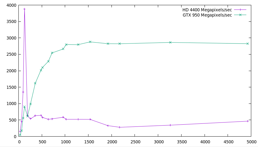 I'm not going to comment much beyond two observations:
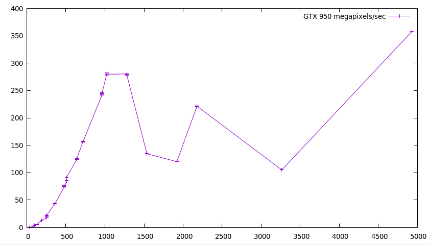 This is interesting. I have few explanations. Probably more benchmarking and
profiling would be needed to make sense of any of it. In fact, it's so
strange that I would suspect a bug, but it does indeed seem to create a
valid bitstream that is decoded by the decoder.
Do note, however, that seemingly even on the smallest resolutions, there's a
1.7 ms base cost (you can't see it on the picture, but you'd see it in an
unnormalized graph). I don't have a very good explanation for this either
(even though there are some costs that are dependent on the alphabet size
instead of the number of pixels), but figuring it out would probably be a
great start for getting the performance up.
So that concludes the series, on a cliffhanger. :-) Even though it's not in a
situation where you can just take it and put it into something useful, I hope
it was an interesting introduction to the GPU! And in the meantime, I've
released version 1.6.3 of
This is interesting. I have few explanations. Probably more benchmarking and
profiling would be needed to make sense of any of it. In fact, it's so
strange that I would suspect a bug, but it does indeed seem to create a
valid bitstream that is decoded by the decoder.
Do note, however, that seemingly even on the smallest resolutions, there's a
1.7 ms base cost (you can't see it on the picture, but you'd see it in an
unnormalized graph). I don't have a very good explanation for this either
(even though there are some costs that are dependent on the alphabet size
instead of the number of pixels), but figuring it out would probably be a
great start for getting the performance up.
So that concludes the series, on a cliffhanger. :-) Even though it's not in a
situation where you can just take it and put it into something useful, I hope
it was an interesting introduction to the GPU! And in the meantime, I've
released version 1.6.3 of  Here is my monthly update covering what I have been doing in the free software world in October 2017 (

 How do you attract contributors to a new free software project?
I'm in the very early stages of a new personal project. It is
irrelevant for this blog post what the new project actually is.
Instead, I am thinking about the following question:
How do you attract contributors to a new free software project?
I'm in the very early stages of a new personal project. It is
irrelevant for this blog post what the new project actually is.
Instead, I am thinking about the following question:


 I d like to start making weekly reports again on my free software efforts. Part of the reason for these reports is for me to see how much time I m putting into free software. Hopefully I can keep these reports up.
 This week's energy was provided by Club Mate


 A good six years ago I
 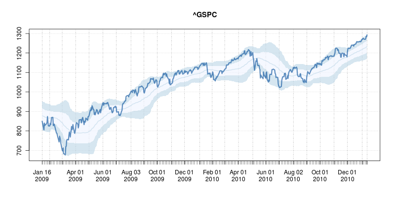 The code uses a few standard finance packages for R (with most of them maintained by
 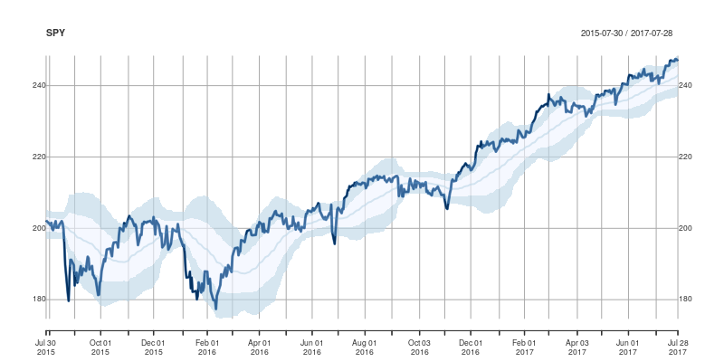 Comments and further enhancements welcome!

 After the workshop on Saturday, members of the OSCAL team successfully reconstructed the SDR and antenna at the Debian info booth on Sunday and a wide range of shortwave and ham signals were detected:
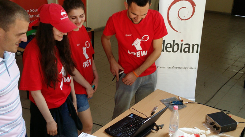 Here is a close-up look at the laptop, RTL-SDR dongle (above laptop), Ham-It-Up converter (above water bottle) and MFJ-971 ATU (on right):
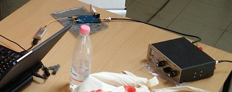 Buying the parts
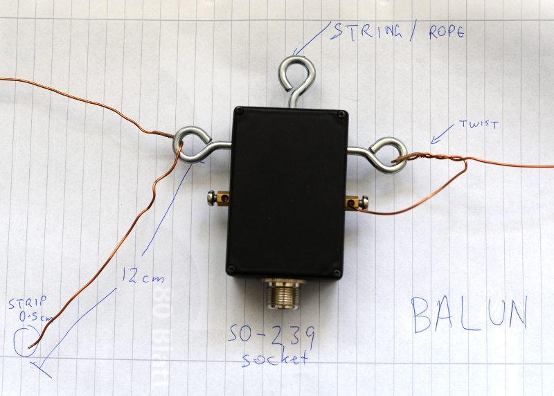 Configuring gqrx for the up-converter and shortwave signals
Inspect the up-converter carefully. Look for the crystal and find the frequency written on the side of it. The frequency written on the specification sheet or web site may be wrong so looking at the crystal itself is the best way to be certain. On my Ham It Up, I found a crystal with 125.000 written on it, this is 125 MHz.
Configuring gqrx for the up-converter and shortwave signals
Inspect the up-converter carefully. Look for the crystal and find the frequency written on the side of it. The frequency written on the specification sheet or web site may be wrong so looking at the crystal itself is the best way to be certain. On my Ham It Up, I found a crystal with 125.000 written on it, this is 125 MHz.
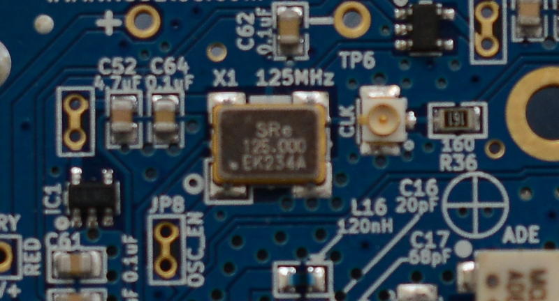 Launch gqrx, go to the File menu and select I/O devices. Change the LNB LO value to match the crystal frequency on the up-converter, with a minus sign. For my Ham It Up, I use the LNB LO value -125.000000 MHz.
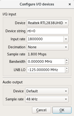 Click OK to close the I/O devices window.
On the Input Controls tab, make sure Hardware AGC is enabled.
On the Receiver options tab, change the Mode value. Commercial shortwave broadcasts use AM and amateur transmission use single sideband: by convention, LSB is used for signals below 10MHz and USB is used for signals above 10MHz. To start exploring the 20 meter amateur band around 14.2 MHz, for example, use USB.
Click OK to close the I/O devices window.
On the Input Controls tab, make sure Hardware AGC is enabled.
On the Receiver options tab, change the Mode value. Commercial shortwave broadcasts use AM and amateur transmission use single sideband: by convention, LSB is used for signals below 10MHz and USB is used for signals above 10MHz. To start exploring the 20 meter amateur band around 14.2 MHz, for example, use USB.
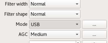 In the top of the window, enter the frequency, for example, 14.200 000 MHz.
Now choose the FFT Settings tab and adjust the Freq zoom slider. Zoom until the width of the display is about 100 kHZ, for example, from 14.15 on the left to 14.25 on the right.
In the top of the window, enter the frequency, for example, 14.200 000 MHz.
Now choose the FFT Settings tab and adjust the Freq zoom slider. Zoom until the width of the display is about 100 kHZ, for example, from 14.15 on the left to 14.25 on the right.
 Click the Play icon at the top left to start receiving. You may hear white noise. If you hear nothing, check the computer's volume controls, move the Gain slider (bottom right) to the maximum position and then lower the Squelch value on the Receiver options tab until you hear the white noise or a transmission.
Adjust the Antenna Tuner knobs
Now that gqrx is running, it is time to adjust the knobs on the antenna tuner (ATU). Reception improves dramatically when it is tuned correctly. Exact instructions depend on the type of ATU you have purchased, here I present instructions for the MFJ-971 that I have been using.
Click the Play icon at the top left to start receiving. You may hear white noise. If you hear nothing, check the computer's volume controls, move the Gain slider (bottom right) to the maximum position and then lower the Squelch value on the Receiver options tab until you hear the white noise or a transmission.
Adjust the Antenna Tuner knobs
Now that gqrx is running, it is time to adjust the knobs on the antenna tuner (ATU). Reception improves dramatically when it is tuned correctly. Exact instructions depend on the type of ATU you have purchased, here I present instructions for the MFJ-971 that I have been using.
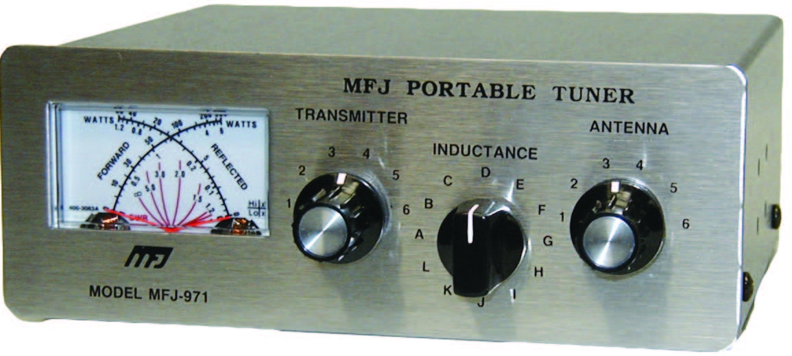 Turn the TRANSMITTER and ANTENNA knobs to the 12 o'clock position and leave them like that. Turn the INDUCTANCE knob while looking at the signals in the gqrx window. When you find the best position, the signal strength displayed on the screen will appear to increase (the animated white line should appear to move upwards and maybe some peaks will appear in the line).
When you feel you have found the best position for the INDUCTANCE knob, leave it in that position and begin turning the ANTENNA knob clockwise looking for any increase in signal strength on the chart. When you feel that is correct, begin turning the TRANSMITTER knob.
Listening to a transmission
At this point, if you are lucky, some transmissions may be visible on the gqrx screen. They will appear as darker colours in the waterfall chart. Try clicking on one of them, the vertical red line will jump to that position. For a USB transmission, try to place the vertical red line at the left hand side of the signal. Try dragging the vertical red line or changing the frequency value at the top of the screen by 100 Hz at a time until the station is tuned as well as possible.
Try and listen to the transmission and identify the station. Commercial shortwave broadcasts will usually identify themselves from time to time. Amateur transmissions will usually include a callsign spoken in the
Turn the TRANSMITTER and ANTENNA knobs to the 12 o'clock position and leave them like that. Turn the INDUCTANCE knob while looking at the signals in the gqrx window. When you find the best position, the signal strength displayed on the screen will appear to increase (the animated white line should appear to move upwards and maybe some peaks will appear in the line).
When you feel you have found the best position for the INDUCTANCE knob, leave it in that position and begin turning the ANTENNA knob clockwise looking for any increase in signal strength on the chart. When you feel that is correct, begin turning the TRANSMITTER knob.
Listening to a transmission
At this point, if you are lucky, some transmissions may be visible on the gqrx screen. They will appear as darker colours in the waterfall chart. Try clicking on one of them, the vertical red line will jump to that position. For a USB transmission, try to place the vertical red line at the left hand side of the signal. Try dragging the vertical red line or changing the frequency value at the top of the screen by 100 Hz at a time until the station is tuned as well as possible.
Try and listen to the transmission and identify the station. Commercial shortwave broadcasts will usually identify themselves from time to time. Amateur transmissions will usually include a callsign spoken in the  I am starting a work with the students of
 I would love to hear from others what they think of that approach, if
they have improvements or if the above copyToAllToggle function could be
merged in. Ideally, Xmonad would just parse the STICKY client messages
and do the right thing - maybe even directly in CopyWindow - but I have
found this enough Haskell for one day.
You can see the
I would love to hear from others what they think of that approach, if
they have improvements or if the above copyToAllToggle function could be
merged in. Ideally, Xmonad would just parse the STICKY client messages
and do the right thing - maybe even directly in CopyWindow - but I have
found this enough Haskell for one day.
You can see the